Design
The Design tab provides access to all the tools needed to design the report template with all the workbook and worksheet features you wish.
Themes
The Themes option opens the Theme Builder which is used to maintain report appearance.
For more information, see Template Themes.
Content
Insert
This menu is used for inserting things into the template like cells, worksheets, named ranges, pictures, shapes, functions, tables of summary calculations and/or hyperlinks.
Summary Table
Use this to insert a table of summary calculations for a given cell range in the worksheet rather than add each formula individually on the sheet.
 |
 |
The example above demonstrates how this option can be used to add the Average, Mininum and Maximum formulas for each Column from C:F between rows 6:36. The table of summary calculations is put onto the sheet starting cell C38.
Source
The cell range containing the values to be calculated. If the number of rows (or columns) of data brought into the report is unknown and the data connection is configured to insert, only the first two rows (or columns) need to be specified. The formulas will automatically adjust as each row (or column) is inserted into the sheet (see the Understanding Insert Placement section in Data Connections).
Summarize
When summarizing the Source values, this can be done by Columns or by Rows, depending on the direction of the data.
Target
The destination (upper left corner) for the summary table. By default, this will be set to two rows beneath the Source range but can be customized.
Calculations
Several basic summary calculations are provided to choose from, all of which can be selected at once. In the worksheet, these will appear in the same order as they do in this list.
Add Labels
If checked, labels for each calculation are placed in the worksheet. If Columns is selected for the Summarize setting, the labels are placed one column to the left of the Target cell. If Rows is selected, the labels are placed one row above the Target cell.
Add Borders
If checked, an outside border is added around the summary table (not including labels).
Chart
Anatomy of a Chart
A common usage of charts is to visualize the data collected by Data Groups. A Data Group has several components which influence chart configuration.
 |
The number of Selected Columns influences the number of series in the chart.
The Output Options for Timestamp on first column and Include Heading influence the charts category axis and series names.
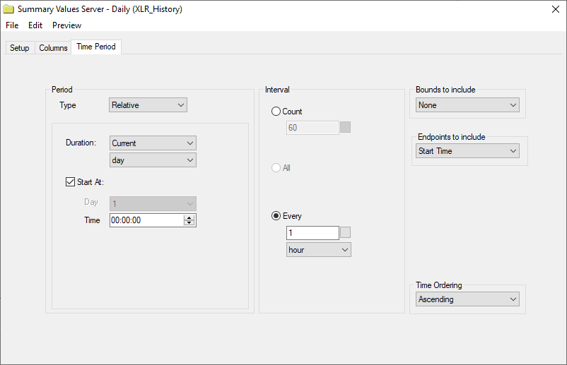 |
The number of rows collected into the report by the Data Group also influences the chart configuration. In the above example, data is returned at a 1 hour Interval over the Period of the Current Day, therefore 24 rows are returned.
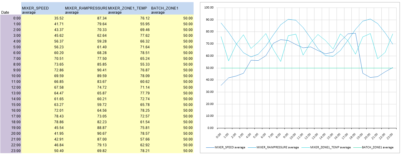 |
In the above diagram, the data from the example Data Group is mapped onto a line chart.
The Category Column containing the timestamps in purple is displayed as the horizontal axis labels.
The Series values are displayed as the 24 rows of tag data.
The Header rows returned by the headings included in the Data Group in blue are used in the legend.
Empty Chart
This option is only available in the XLReporter Template Studio.
When selected, an empty chart is added to the worksheet at the currently selected cell. From here the chart can be configured by either right-clicking it or by selecting the Design and Format options in the Chart area of the ribbon. For details, see the Chart Configuration section below.
Express Chart
This option is available in the XLReporter Template Studio by selecting Express Chart under the Chart button (or clicking the Chart button itself). In Excel, this option is available by clicking the Chart button.
Before selecting this option, it is recommended to highlight the range of cells to apply to the chart. By doing this ahead of time, in most cases, in the Express Chart all that needs to be selected is the chart type itself.
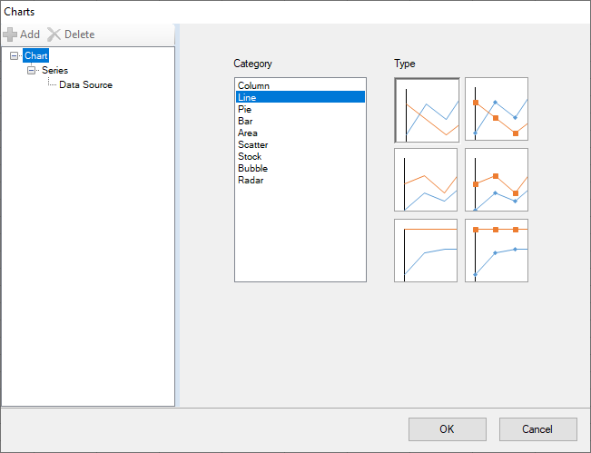 |
The Chart branch on the left displays a list of every available chart to configure. When a Category is selected, each Type of chart for it is displayed. Hover over any Type to see a description of the chart type.
To configure the series for the chart, on the left, select the Series, Data Source branch.
 |
Header Rows defines how many rows, if any, at the top of the Selected Range are used as labels for the chart data series.
Category Column specifies whether or not the left-most column in the Selected Range is added as a series on the Category axis of the chart (if the selected Chart Type supports a category axis).
Some chart types, like line charts, support a category type like Date or Text to define the type of data the category axis is comprised of. If the column contains dates (without times), the category can be set to Date, for anything else (include dates with times), this should be set to Text. Other chart types do not have this level of configuration in which case this can set to Yes to treat the leftmost column of the Selected Range as the Category axis or No to treat the leftmost column as the first series of the chart.
Placement is the cell where the upper left corner of the chart appears initially. The chart can be moved and resized after it is added.
Once the chart is added, in Excel it can be modified and manipulated by using the options available in the Chart Design and Format ribbon options that appear when the chart is selected.
In the XLReporter Design Studio, the chart can be modified and manipulated by either right-clicking it or by selecting the Design and Format options in the Chart area of the ribbon. For details, see the Chart Configuration section below.
Chart Configuration
The following options are available in the XLReporter Template Studio when a chart is selected.
Data Series
This option is available from the right-click menu or from the Design button in the ribbon.
 |
From the Chart branch the overall chart type can be changed by selecting the Category and Type.
Each series in the chart is displayed as a branch under Series on the left. A new series can be added by selecting the Series branch and clicking the Add button. A series can be deleted by selecting the specific series branch and clicking the Delete button.
The specific series branch displays general settings based on the chart type.
 |
The Chart Type branch provides the option to the change the type of the specific series selected rather than every series in the chart.
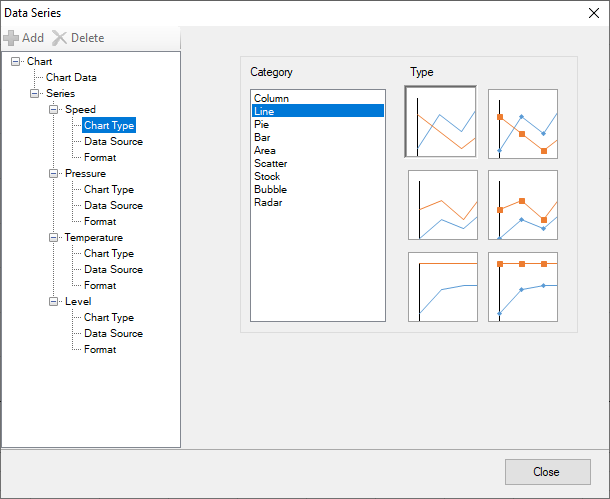 |
Use this option to configure combination chart such as a chart some series are shown as columns and others are shown as lines.
The Data Source branch displays where the data for the series comes from.
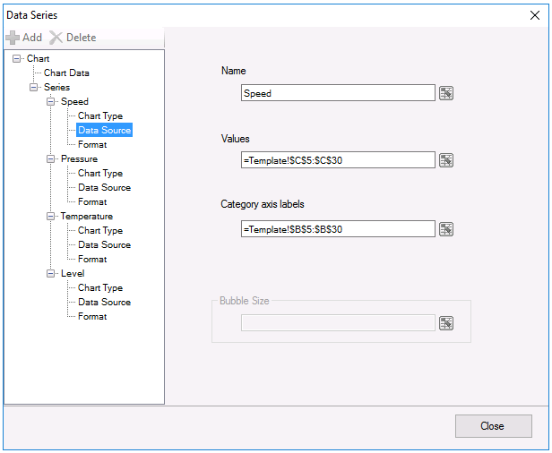 |
The Name can be a fixed name or a cell reference. Values is the series values and Category axis labels are the X-axis.
The Format branch displays information about how the series is formatted on the chart.
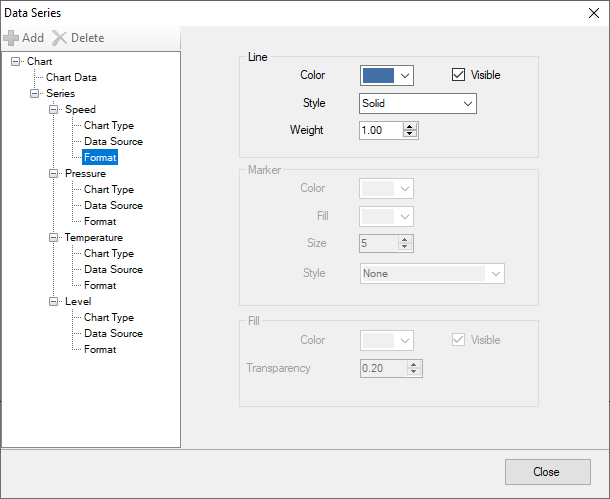 |
The settings displayed are based on the Chart Type of the series. From here things like styles and colors can be configured to customize the look of each series.
Chart Format Settings
Chart Area
This option is available from the right-click menu or from the Format button in the ribbon.
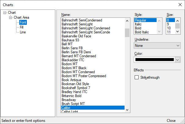 |
Use these settings to modify the Font, Fill color and Line options for the chart area.
Plot Area
This option is available from the right-click menu or from the Format button in the ribbon.
 |
Use these settings to modify the Fill color and Line options for the plot area.
Legend
This option is available from the right-click menu or from the Format button in the ribbon.
 |
Use these settings to show a legend on the chart and choose where it should be positioned.
Once shown, use the branches beneath to configure the Font, Fill color and Line options for the legend.
Title
This option is available from the right-click menu or from the Format button in the ribbon.
 |
Use these settings to configure a Title for the chart.
Once applied, use the branches beneath to configure the text Alignment, Font, Fill color and Line options for the title.
Axes
This option is available from the right-click menu or from the Format button in the ribbon.
 |
Use these settings to configure the X and Y axes for the chart. For each Axis there are a number of different options available to configure how each is displayed in the chart.
Copy Chart
This option copies the selected chart as a new chart on any worksheet in the workbook.
 |
The Target setting is the top left corner of the worksheet of where the new chart is copied.
Snap To Grid
This option is available from the Format button in the ribbon.
When selected, if the chart is moved or resized when the mouse is released the chart is resized to completely fit the range of cells that contain it.
Consider the following:
 |
The chart encompasses the range I4:P14 but does not fill the entire range. By enabling Snap To Grid and moving or resizing the chart slightly, the chart now appears as:
 |
Note that once the Snap To Grid option is enabled it will take affect every time the chart is moved or resized until the option is selected again to shut it off even if the chart is de-selected and then selected again.